ג'קסון הול
ממוקם ביופי הפראי של ג'קסון הול, ויומינג, עם פארקים לאומיים כרקע מדהים, הת'ר ג'יימס ג'קסון הביאה את הקליבר הגבוה ביותר של יצירות אמנות ושירותים למערב Intermountain במשך למעלה מעשור.
הת'ר ג'יימס, המספקת את הקהילה הייחודית שהופכת את ג'קסון הול ליעד שאין שני לו לתרבות האמריקאית ולחיק הטבע, שואפת לספק מבחר שאין דומה לו של יצירות אמנות ושירותי כפפות לבנות למקומיים ולמבקרים כאחד.
172 סנטר סטריט, סוויטה 101
תיבת דואר 3580
ג'קסון הול, WY 83001
(307) 200-6090
שעות פתיחה: 1 בדצמבר 2025 עד 28 במרץ 2026
שלישי - שבת 10:00 עד 17:00
תערוכות
גרפיקה בתצוגה

אנדרו וייט

ריצ'רד סרה

אלכסנדר קלדר

אלכסנדר קלדר

אלכסנדר קלדר

אלכסנדר קלדר

אלכסנדר קלדר
_tn47464.jpg "HARRY BERTOIA-Untitled (Sounding Sculpture)")
הארי ברטויה

הארי ברטויה

מרי קורסה

אנדי וורהול

ריי פארקר

ראסל יאנג

דרום מזרח אסיה

ויין תיאבאוד
_tn48022.jpg "RUSSELL YOUNG-Mick Jagger (Sympathy for the Devil)")
ראסל יאנג
_tn47869.jpg "ELLSWORTH KELLY-Untitled, (from portfolio Eight by Eight to celebrate the Temporary Contemporary)")
אלסוורת קלי

אלכס כץ

ראסל יאנג

ראסל יאנג

ראסל יאנג

ראסל יאנג
_tn47873.jpg "ELLSWORTH KELLY-Red Curve (Black State)")
אלסוורת קלי

יוזף אלברס

יוזף אלברס

לורנס שילר
יועצים

אנדראה ריקו דאלין
סגן נשיא בכיר
ג'קסון הול, ויומינג
עם למעלה מ -20 שנה בתעשייה, אנדראה מחזיקה בתואר ראשון בתולדות האמנות עם קטין באמנות יפה מאוניברסיטת בינגהמטון, בינגהמטון, ניו יורק, ותואר שני באמנות מודרנית, אנינות טעם והיסטוריה של שוק האמנות מכריסטי'ס חינוך, ניו יורק, ניו יורק. היא מביאה מומחיות מניסיונה הן במוזיאונים והן בבתי מכירות פומביות, לאחר שעבדה במוזיאון נלסון-אטקינס לאמנות בקנזס סיטי ובכריסטי'ס בניו יורק.
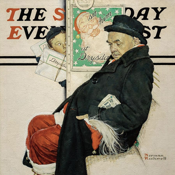
מאז שהצטרפה להת'ר ג'יימס פיין ארט ב-2015, אנדריאה השיגה משלוחים ועזרה לבנות אוספים פרטיים ומוזיאונים בולטים עם אמנים חשובים, הכוללים את קלוד מונה, אלפרד סיסלי, אנרי מאטיס, אדגר דגה, נורמן רוקוול, אנדרו וייט, איליין דה קונינג, אנדי וורהול וטום וסלמן.

שרה פישל
סגנית נשיא בכירה הת'ר ג'יימס ויו"ר משותף, ייעוץ אמנותי
ג'קסון הול, ויומינג
לשרה יש תשוקה עמוקה לאמנות ולהיסטוריה כאחד, לאחר שגדלה מוקפת באמנות. היא דחפה את האהבה המוקדמת הזו ליותר מעשור של ניסיון בעולם האמנות, וניווטה בין גלריות, בתי מכירות פומביות ומוזיאונים.
כמאמינה גדולה בלמידה ובחוויה של כל היבט של העסק, שרה עבדה ברחבי עולם האמנות בתפקידים שונים, והביאה גישה הוליסטית לייעוץ ולעבודתה. מאז 2015, שרה הייתה שחקנית מפתח בהת'ר ג'יימס פיין ארט, שם סיפקה שירות לקוחות מהשורה הראשונה, ניהלה את גלריית ג'קסון הול, אצרה תערוכות גלריה ובתי אספנים, והובילה יוזמות קידום מכירות אסטרטגיות.
לאחר שקיבלה תארים בעיתונאות ובהיסטוריה של האמנות מאוניברסיטת ניו יורק, המשיכה שרה את הבסיס האקדמי שלה עם תואר שני מתוכנית האמנות, המשפטים והעסקים של כריסטי בלונדון. מעבר לעיסוקיה המקצועיים והחינוכיים, שרה מעורבת באופן פעיל בארגונים הקרובים אליה, כולל מוזיאון הזיכרון לשואה של ארצות הברית וכחברת דירקטוריון של ג'קסון הול פאב ארט ו-Teton Adaptive.
כיו"ר משותף, שרה מביאה את ניסיונה האישי ואת הידע שלה באמנות ובאיסוף לכל אינטראקציה, ותמיד מחפשת את הפתרון הטוב ביותר לצרכי לקוחותיה.
בחדשות
וידאו

הת'ר ג'יימס ג'קסון הול – מבחר אמנות קיץ 2025 עם שרה פישל
וידאו

הת'ר ג'יימס ג'קסון הול – מבחר אמנות קיץ 2025 עם אנדראה ריקו-דאלין
חדשות

נמכרו לאחרונה עבודות מובילות
חדשות

גיבסון, דאן וקרוצ'ר התקנות
חדשות

למכור את השבב הכחול שלך עובד עם הת'ר ג'יימס
חדשות

הת'ר ג'יימס מוזיאון לאמנות הלוואה
חדשות

קלוד מונה מכר לאחרונה יצירות
חדשות

שוק האמנות מרץ 2023
ללחוץ
הת'ר ג'יימס השאילה את ואן גוך שנכלל ב"ואן גוך באמריקה" מושך קהל
ללחוץ
הת'ר ג'יימס משאילה את מייג'ור ואן גוך ל"ואן גוך באמריקה"
ללחוץ

ג'קסון הול חדשות ומדריך דגשים הת'ר ג'יימס ארבע מאות שנים של אמנות
חדשות

חוסן שוק האמנות
ללחוץ
ג'קסון הול חדשות ומדריך תכונות הת'ר ג'יימס עבודות חדשות
חדשות

אמנות כהשקעה
וידאו

להכיר את הת'ר ג'יימס אמנות
חדשות

חוגגים 25 שנה של הת'ר ג'יימס אמנות
חדשות

הת'ר ג'יימס פותחת את חברת הייעוץ לונדון
ללחוץ
ג'קסון הול חדשות & מדריך מדווח הת'ר ג'יימס נותן אספנים ממצאים נדירים
וידאו

נשים אמניות עם אנדראה ריקו-דאלין
וידאו

דה קונינג עם אנדראה ריקו-דאלין
חדשות

הדרכה בגלריה ג'קסון הול – קיץ 2021
קטלוגים

מהפכות באמנות המודרנית
קטלוגים

הת'ר ג'יימס אמנות – אודותינו
וידאו

תערוכת אדוארד הופר


שירותים
הת'ר ג'יימס פיין ארט מספקת מגוון רחב של שירותים מבוססי לקוח המתאימים לצרכי איסוף האמנות הספציפיים שלך. צוות התפעול שלנו כולל מטפלים מקצועיים באמנות, מחלקת רשם מלאה וצוות לוגיסטי בעל ניסיון רב בהובלת אמנות, התקנה וניהול אוספים. עם שירות כפפות לבנות וטיפול מותאם אישית, הצוות שלנו עובר את הקילומטר הנוסף כדי להבטיח שירותי אמנות יוצאי דופן עבור לקוחותינו.


הכירו אותנו
גרפיקה מוצגת
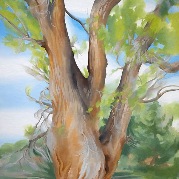
,_new_mexico_tn40147.jpg "GEORGIA O'KEEFFE-Cottonwood Tree (Near Abiquiu), New Mexico")
ג'ורג'יה אוקיף
_tn37743.jpg "JOAN MIRO-Tête de femme (déesse)")
ג'ואן מירו

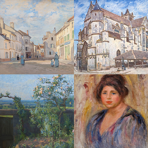
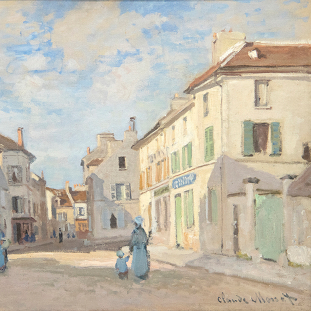
אלפרד סיסלי

וילם דה קונינג
_tn43950.jpg "WINSLOW HOMER-In the Wheatfield (Girl Standing in a Wheat Field)")
וינסלו הומר

ויין תיאבאוד

גרהרד ריכטר

שון סקאלי

טום ווסלמן

אירווינג נורמן
